

I sure hope these characters have significant meaning to the owner and he did not pick them randomly.
At first I had trouble to realize it was 自由 due to the poor quality of 由. I thought it was "自生" which means "growing wild/native" in Japanese.
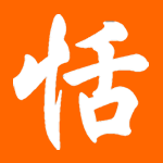
Adam has commented that it is not 九 but a poorly miswritten simplify version of 龍, which is 龙.
九 = nine
艺 (traditional version: 藝) = art; talent, ability; craft
术 (traditional version: 術) = skill, art; method; trick, device
艺术 (traditional version: 藝術) = art
自 = self, private, personal; from
由 = cause, reason; from
自由 = freedom; free; liberty
玉 = jade, precious stone, gem
good shit for all your life
ReplyDeleteI suspect that the first character might be a crudely done simplified 龍(龙), 九 is only composed of 2 strokes, this one seems to have more. Either way, it's a poorly drawn tattoo that doesn't conform to the calligraphy strokes of Chinese, let alone have any meaning other than what it means to the bearer.
ReplyDeletePeople need to understand that stroke order and count are not simply a matter of aesthetics, the correct stroke count is as important as crossing a "t" and dotting an "i" in English, the wrong stroke count can render a character illegible, as the first character and 由 amply illustrate.
If people really want to get a tattoo that expresses something in Chinese, I don't think it's too wise to rely on the discretion of the tattoo artist to take liberties with the design, this is barely Chinese.
Traditional Form: 藝術
ReplyDeletei totally agree with adam (well, except for that the first character might be 龙; there aren't enuf "strokes" there for that. it's not unusual for the tattoo artist to split one stroke into two, like in 艺 and 由). these kinds of tattoos are my least favorite to see. it shows a complete lack of understanding of how chinese is written. there's an utter disregard for stroke order, count and the whole stroke aesthetic, and the result is oh so hideous. it reminds me of that horrible "asian font" a lot of chinese restaurants like to use to make their signs in roman letters look more brushy and "chinese." why would anyone think that they could reapply that to chinese writing is beyond me. these tattoos just scream ugliness and ignorance.
ReplyDeleteI just love the way they look. I didn't try to decipher the supposedly-kanji-ish characters. They look highly original and artistic to my eyes.
ReplyDeleteWhen in high school, I almost dropped the calligraphy class, if that makes any sense...
Why is "art" written horizontally, while the other characters are aligned vertically? It's not difficult to read, but is that an acceptable way to write characters? (I'm not sure)
ReplyDeletegenerally, when you write vertically, you keep writing vertically, and when you write horizontally, you keep writing horizontally. but seeing as how "non-traditional" the rest of the tattoo is, i don't think it matter anymore.
ReplyDeleteThe first character might also be a 几, not that this helps.
ReplyDeleteFor instance, in a magazine where texts flows vertically most of the time, you can insert a pair of horizontally arranged characters in a vertially lined sentence in some cases. This is pretty common among newspapers and magazines in Japan.
ReplyDeleteI'm not saying this is the case, though.