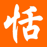
Magazeta in Livejournal.com is a community site about China and Chinese culture written in Russian. Its owner named Ma Yuxi emailed me this photo today:
 http://community.livejournal.com/magazeta/68903.html
I have no idea what the second character is supposed to be.


Going with the theme of the other characters, could it be an extremely fucked up 火? Looks like it's missing the strokes on either side if it is...
ReplyDeleteyeah sarah sounds about right there .... assuming they actually had any idea what they were trying to get the tattoo's to say.
ReplyDeleteThe only other things I could think of (Japanese-wise) would be 'person' or 'to enter' or 'eight' ... but REALLY messed up.
-J-
Yes, it's right. Are you remember "Fifth Ellement"?
ReplyDeleteWind (air), Fire, Earth and Water....
(by MaYuxi)
Either that or a sloppy 人, maybe.
ReplyDeleteIt looks like a nutcracker.
ReplyDeleteAgree that it's probably fire. But I like to think it's a pair of jeans.
ReplyDeletei guess the second one is fire..
ReplyDelete火。。
I concur with everyone on 火. It looks like the left-side stroke bled into the main 人, and the right-side stroke is missing altogether.
ReplyDeleteIt might be a simplified er (儿)or a really fucked up ren (人)
ReplyDeleteThe reason I say it might be a bad ren is because some people would be incined to write it that way because the computer small form looks like its two strokes that meet at a common tip instead of one stroke originating from the other.
My first comment here. Love your blog!
I like how it's basically a total toss-up between 火、人、八、and 入. I would agree that, following the pattern, perhaps it IS 火, but I like entertaining the possibilities.
ReplyDeleteIt looked like 八 to me, if anything. 水 is pretty horrible too.
ReplyDeleteGiven the style of the art, I would guess it to be a severly poorly written 月 (がつ). It's simply missing a stroke, and the top stroke is too thick to be distinguished from the top of the character.
ReplyDeleteI think it just looks like a poorly written 月. If you compare it to the rest of the kanji, it has extremely thick lines, which just likely were slurred together with the top of the character. It is missing a stroke though.
ReplyDeleteI immediately thought it was a bad 人. I certainly hope it's not meant to be 火 - it bears no resemblance whatsoever!
ReplyDeleteWhat a dire tattoo.