
In his email, he has mentioned that the center set of four black characters with red outline 士小王玄where chosen solely based on their looks; therefore I will only focus on the rest two sets of tattoos.
Ryan was told the set of red characters meant “samurai/warrior and something else”. Due to their poor qualify, the two kanji characters looked like either 丈夫 or 大夫.
丈夫means “hero; gentleman; warrior; manly person” in Japanese, and “husband” in Chinese. 大夫 means “high steward; grand master” in Japanese, and “doctor” in northern part of China.
I don’t know what those three red katakana キソグ (or キング) meant, except phonetically they are “ki-so-gu” (or "ki-n-gu", aka "king").
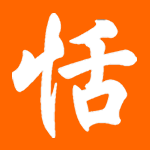
He was also told the set of black characters meant “bitter and sweet/kind”. I did recognize 苦 as “bitter; hardship, suffering”, but I had trouble trying to figure out the three katakana below.
ジヨイ, “ji-yo-i”, perhaps

Actually, the middle katakana in red has the lower part of it drawn from the bottom up. It is "n," not "so." That would make it "ki-n-gu," or "king."
ReplyDeleteThe katakana in black at the bottom looks like "Joey" to me, except I think the middle one is supposed to be small, which would make it "jyo (or jo)-i"--two syllables instead of three.
The second character of the red katakana is 'ン', which makes it キング: kingu : "king."
ReplyDeleteThe black katakana are probably ジョイ: joi : 'joy.'
In modern Japanese, the usual meaning of 丈夫 is "sturdy" or "robust, healthy".
ReplyDeleteFollowing on what mark said,
ReplyDeleteThe last katakana, which I think read "joy", connected with the first phrase to read (something like) "painful joy".
The final set of katakana depends on whether he meant it to read: ジヨイ or ジョイ. The first is "ji-yo-i," perhaps to be joy, and the second would probably mean "Joey" (jo-i).
ReplyDeleteyeah, to repeat what other people have said, it's definitely キング and not キソぐ. and the red hanzi looks like 丈夫, not 大夫 (it means grandmaster in chinese too, but you'd be referring to a rank title from feudal china). the ヨ doesn't look small, but it would only make sense that way, and ジョイ means joy, never joey (ジョーイ).
ReplyDeleteMan, what a random accumulation of crap tattoos. At least they don't mean anything seriously embarrassing, though.
ReplyDelete搞到隻毛腿花斑斑咁......
ReplyDeleteIn any tattoo page like http://www.tatuadores.com/letras.htm, one can find material to laugh, to cry, to wonder... Why do people do THIS?
ReplyDeleteWho cares what they mean, those are some ugly, ugly tattoos. That guy was ripped off if he paid more than $10 for them.
ReplyDeleteWouldn't a visit to Babelfish solve most of these problems? Oy.
ReplyDeleteHe already said he just chose randomly...at least he knows that he doesn't know and honest enough to admit.
ReplyDelete-If one knows, and doesn't know that he knows...wake him up.
-If one doesn't know, and doesn't know that he doesn't know...teach him.
-If one doesn't know, and thinks as if he knows...avoid him.
-If one knows, and knows that he knows...follow him.
Babelfish? Are you joking?
ReplyDeleteIt might help in some cases, but in just as many and probably many more, it would lead to strange, unnatural translations, mistakes caused by the double meaning of words (a machine translator cannot take full account of the context), and not to mention the problem of 'totally boring Times New Roman style font'.
It might well be that the proud owners of
http://www.hanzismatter.com/2005/09/tank.html and
http://www.hanzismatter.com/2005/09/screw-this.html amongst many others used some sort of machine translation or dictionary to achieve their wonderful tattoos.
It might seem that something like a language dictionary or translation tool would solve the problem, but in fact it worsens it by giving false confidence to those who wield them in ignorance.
Hmm... it looks like "丈夫" to me. Do the second and third lines often cross in hand written 大s? I wouldn't know since I'm still at the point where I carefully print everything I write in Chinese.
ReplyDeleteAlso "苦" means cool, or at least it does in Taiwan.
Yup, the katakana are definitely 'king' and 'joy'. 'Bitter Joy' could, at a pinch, mean something akin to what the guy was told it did.
ReplyDeleteGiven the use of katakana, the upper portion is probably meant to have a Japanese meaning. 丈夫 would indeed be "sturdy, robust, healthy". 大夫 is another name for a chief retainer (家老), which I guess would fit the 'warrior' bit.
I would hate to have that mess on my skin.
Following the 苦 is a い, which would make the word a Japanese i-adjective. 苦い means "bitter", but it also could be a poorly written 若い, which means "young".
ReplyDeleteAside: 酷 (ku4) means "cool" in Taiwan, as far as this Taiwanese person knows. 苦 is very much "bitter."
ReplyDeletei second that. i have never seen 苦 used to mean cool except perhaps erronously. 酷 is the correct word to use. (another example why tones are so important in chinese)
ReplyDeleteBabelfish....worst translations ever made online. dictionary.com or google translate are more reliable though they mostly are inaccurate also. I saw that in Japanese. At engrish.com, it says that "to create your own Engrish, translate a sentence through Babelfish into Japanese, and retranslate into English." it works really.
ReplyDeleteI think that the only place where babelfish works, is the inside of "Hitchhiker's Guide to the Galaxy" books. And that's for interperation, not for translation.
At first I thought that 苦い (bitter) was perhaps a mistake for 若い (young), just because it seemed a more likely thing to want on your skin.
ReplyDeleteHorrible as the calligraphy is, though, it's reasonably clear, and the victim does say "he was also told the set of black characters meant “bitter and sweet/kind”".
Hello all this is Ryan the one who sent in the email to Tian. I appreciate all your responses and especially Tians for taking the time to look into this for me.
ReplyDeleteFirstly the meaning behind both of these were pretty accurate. They are not connected words. They were placed for a specific reason in that specific order. They may not look perfect, but I can adjust them if needed.
Second after seeing these meaning and why i choose these words it makes sense what they all mean again. Which is somewhat difficult to explain, but in short its the meaning of each of my family members names. 丈夫 was what its meant to look like. Standing for "Warrior." キソグ was meant to be "King".
The middle set is the oldest and still very much nothing. But eventually I will turn it into something better.
The bottom set was the meaning of my wifes name Bitter, joy. The two symbols next to 苦 i would assume mean nothing. These symbols ジヨイ, were meant to stand for "joy".
They all have a specific meaning to me thats why they are set up as they are. If you have suggestions to make them look cleaner I would gladly take them into consideration. I am practially covered in traditional japanese tatoos so I take this very seriously. Obviously quite a bit more than I did a few years ago, when I picked up my first set in the middle in black.
Thank you all very much for your help in reminding and reassuring me that these meaning are what they are supposed to be.
There is only one character next to 苦, which by itself already means "bitter" in Chinese. 苦い, with both the kanji/hanzi and hiragana together, is the Japanese version of "bitter."
ReplyDeleteI'm not sure there is a way to make these tattoos look "cleaner" without completely re-doing them. I can understand why you chose the characters that you did, but the penmanship on all of them is quite horrid. Frankly, they look like the writings of a child rather than the writings of a professional. If you have other traditional Japanese tattoos on you, if those are done well, then I can't imagine that the character ones would match them.
Babelfish can help in most of the cases, not all. Obvious a machine translation is never going to be perfect. It's just better than pulling something out from the tattoo artist's behind, IMHO.
ReplyDeleteOkay, maybe I was a *little* harsh on machine translation. Probably something to do with having come fresh from a conversation with a guy who, convinced that a foreigner like me couldn't possibly understand his native language, insisted on running everything he wanted to say through machine translation into English for my 'benefit', despite the fairly obvious fact that I was using his native language exclusively, and indeed used it to politely tell him, repeatedly, that I really couldn't understand that weird machine English and could he please show me the original so I could understand it. Hm.
ReplyDeleteAnyway. Okay, maybe it's better than absolutely nothing. But I stand by my point so much as to say those cases where it would result in an error of translation would be a significant enough percentage to make it inadvisable. The only way of knowing if your tattoo design was one of that percentage would be to check with a competent, trustworthy native translator, rendering the babelfish stage somewhat redundant.
its says "ki-n-gu" not "ki-so-gu" because of the lant of the strokes. so it does say "king"
ReplyDeleteThose are some ugly tatoos. Whatever the meaning may be, aesthetically, it's a mess.
ReplyDeleteFrom a Japanese standpoint, the meaning is actually quite easy to see:
ReplyDeleteThe first one is missing one character (should be 丈夫なキング), but nonetheless the meaning of "Heroic King" is easy to understand. The second one comes accross as "Bitter Joy".
-Keatonatron
This is directed a Ryan, the origional emailer. Aesthetically speaking, the two outer tats look fine, it's the center piece that throws it all off balance since the calligraphy is so shoddy. Also the thickness of the strokes do not tie in with the strokes of the others. My suggestion to you would be to have it removed and replace it with something more fitting. Since it has no real significance in your life the only real issue is the expence. It is so big and dark, I can't see how any modification or a cover-up would do any good.
ReplyDelete